
Pilot Mode
On designing the interface for a new kind of cockpit.

The Briefing
In my professional life, I lead up a team of UX Designers, Strategists, Product Shapers and Front-End Developers. Some time ago, an interesting opportunity arose. A new and exciting start-up approached with an intriguing proposition.
We were brought in to design the next generation of human-machine interface.
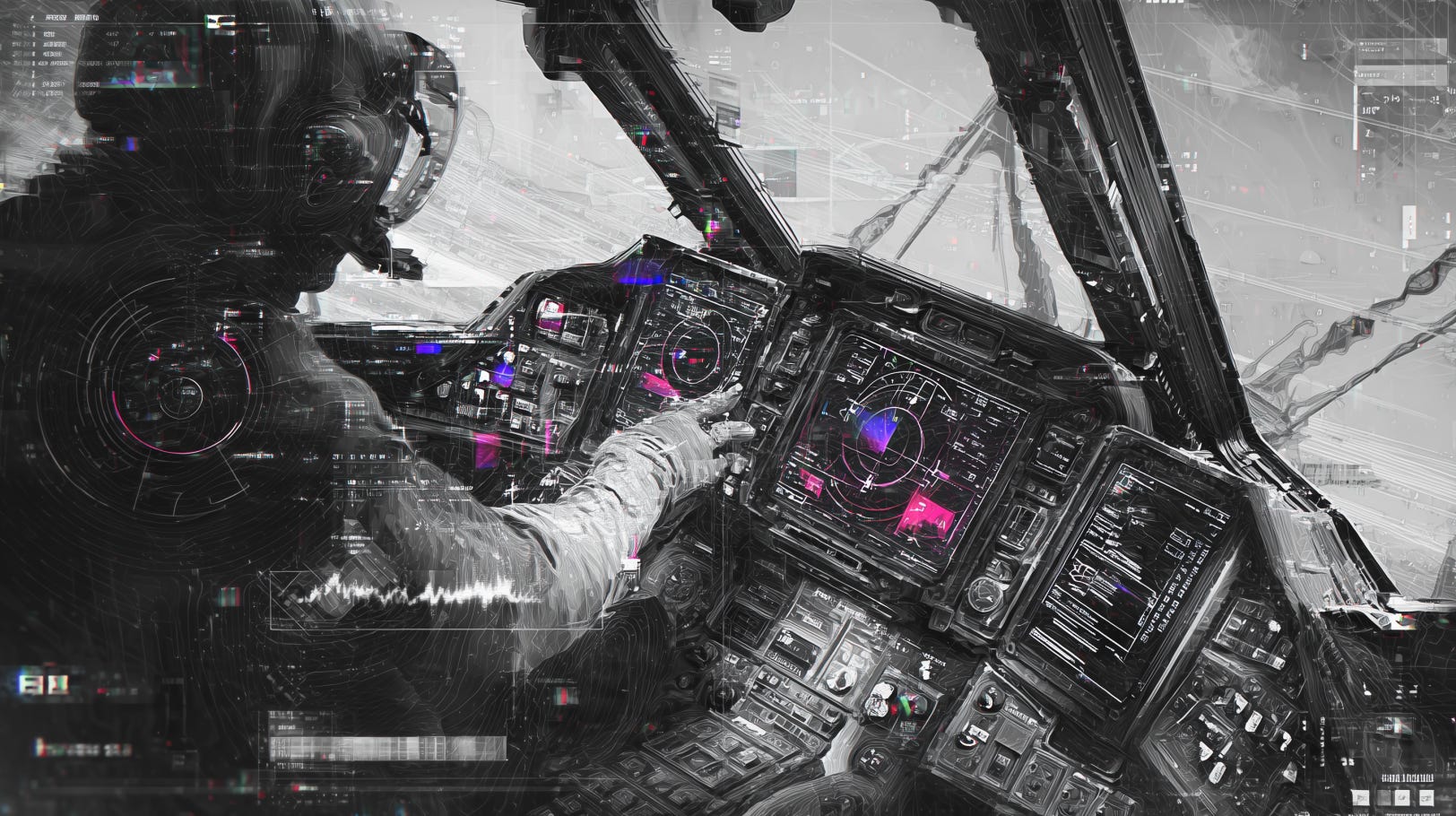
A screen-based cockpit for a new kind of vehicle. The kind of brief UI designers dream of. At least I do.
The term they use to describe the vessel is sea-glider. A new vessel that uses ground effect to cruise just above the water (okay, it’s been done before, but let's leave that story for now1).
A plane-but-not-quite, it hovered just below FAA classification. Low enough to dodge regulation, fast enough to change how people move across water.
We weren’t designing for pilots, we were told. We were designing for mariners—boat operators with limited flight training, used to simple affordances:
one wheel, one throttle.
push forward, go forward.
turn the wheel, change direction.
// control schema: simplified
// user assumption: maritime, not aviation
We had to build where maritime navigation meets electric propulsion diagnostics.
A weather-aware, camera-assisted system. Collision detection. Route planning. Possibly even a heads-up overlay on the windshield.
It felt like we were designing the future. Enabling a captain to fly a plane with boat-like controls.
The Vessel
The vehicle didn’t exist. Well, not yet. Not entirely.
The only flight so far? A quarter-scale model flown remotely.
No pilot, no passenger. Just sea-foam, sensors, and radio signal.
It floated and cruised on its hull like a ’70s Starcraft or a Boston Whaler. Then it rose onto its foils, slicing the chop like a new age America’s Cup AC75 racing boat. (And if you haven’t seen one, google it.2 Star Wars shit.)
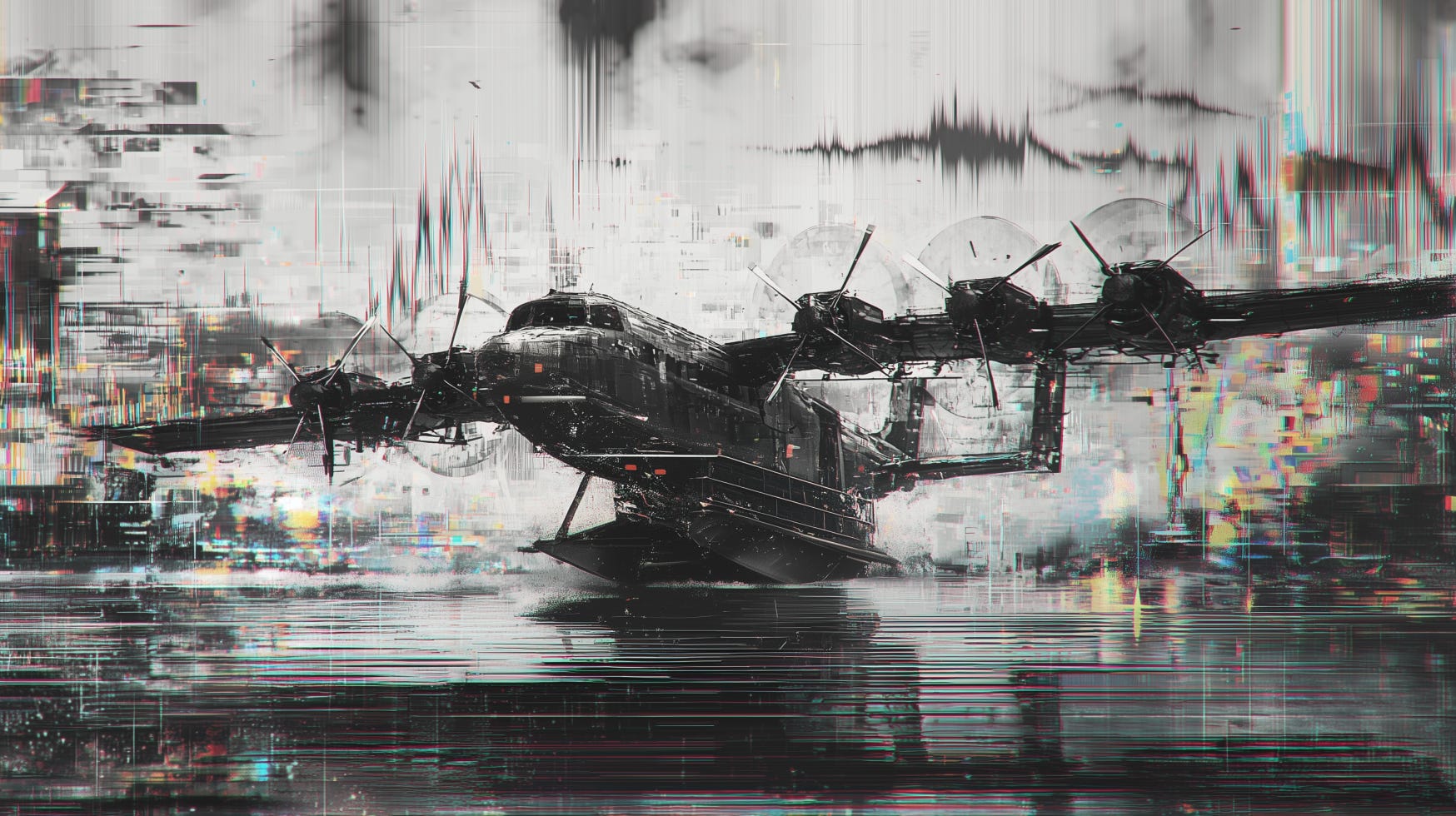
Anyway, it started to really rip. And then—it snapped right out of the water. It flew.
It landed. And then it did it all again.
The design was proven in miniature and theory. And don't get me wrong, it was a major achievement (and cool as hell).
But no onboard interface. No pressure. No weight. No cockpit and no pilot inside.
Not yet.
The Dream
So we got to work designing a next-gen cockpit interface for a vessel that didn’t exist yet.
This was the dream gig.
Since we were free of FAA design space, the idea was: take the affordances mariners already knew. Pair them with Tesla-grade situational awareness. Make it easy. Easy to sail and fly. And above all, easy to train on.
Besides the throttle and the wheel, a modern electric vessel needs telemetry. The operational state of all twelve propulsion motors. Steering systems. Battery health. Electric load balancing.
All of it fed back to the user in real-time—without overwhelming them. After all, the vehicle was supposed to take care of most of the details.
We imagined a primary view for navigation: route planning, weather adaptation, visual obstacle detection. Maritime charts augmented with forward camera feed all on screen. Maybe even a heads-up overlay on the windshield. There's some very compelling tech to achieve that today.
It felt like science fiction.
The kind of project you’d expect to see designed by Territory Studio (the FUI team behind Blade Runner 2049 and the new Dune, to name a few key projects)—but brought into the real world.
Sleek, speculative, near-future UI made tactile. We were building new interface from the ground up. Or so we thought.
The Test Pilot
Then Dylan showed up. Six-foot-something. Ex–Air Force, he flew F-16s in service, flies 747s now. A few days a month he flies halfway across the world like it’s a morning commute.
He introduced himself by his call sign—a well-known folksinger. So that’s what we all called him. Here, we’ll call him Bob Dylan.
Every concept we showed him, Dylan liked. Every concept we showed him was wrong.
// signal detected - interface mismatchWhen you’ve logged thousands of hours in military and commercial cockpits, you’re not looking for aesthetics. Dylan appreciated them, he really did.
But a pilot is constantly scanning, feeling for what’s off.
We’d jack into the prototype screens in the sim room, power up the projection environment, and he’d look up at the fake water, down at the readout and tell us what he couldn’t see—not because it wasn’t there, but because it wasn’t where his body expected it to be.3
There's a need for immediacy. You have to understand system feedback as quickly as your nervous system can allow. That means every interface affordance is prebuilt in the pilot's mental model. Not learned for this particular control.
The Reset
The shift happened slowly.
At first, Dylan liked what he saw. He was open to the ideas. Curious about the interface concepts. Even optimistic.
But none of them were right. Not because they were messy or unpolished. Because they didn’t match the logic he’d trained into his body from years of flying F-16s at supersonic speeds, and 747s full of passengers at cruising altitude.
Now, in this project, he’d be flying just a few stories off the water. Lower, yes. But risk remained high. You might even say higher.
The margin for error narrows when you’re that close to the surface.4
The systems needed to be legible at a glance. Trusted at a glance. Every bit of latency, novelty, or doubt could mean delay.
So we pivoted. I spent hours in Microsoft Flight Simulator. Yes… for the visuals. But not the views. I needed to understand how different aircraft displayed the same information.
How altimeters behaved. How attitude indicators were placed. How situational awareness lived in the margins of each panel--somewhere between focus and periphery but not quite either.
Each cockpit had a language. I needed to become fluent enough to design in dialect.
We weren’t building a new interface. We were translators with a new goal: fluency.
The Outcome
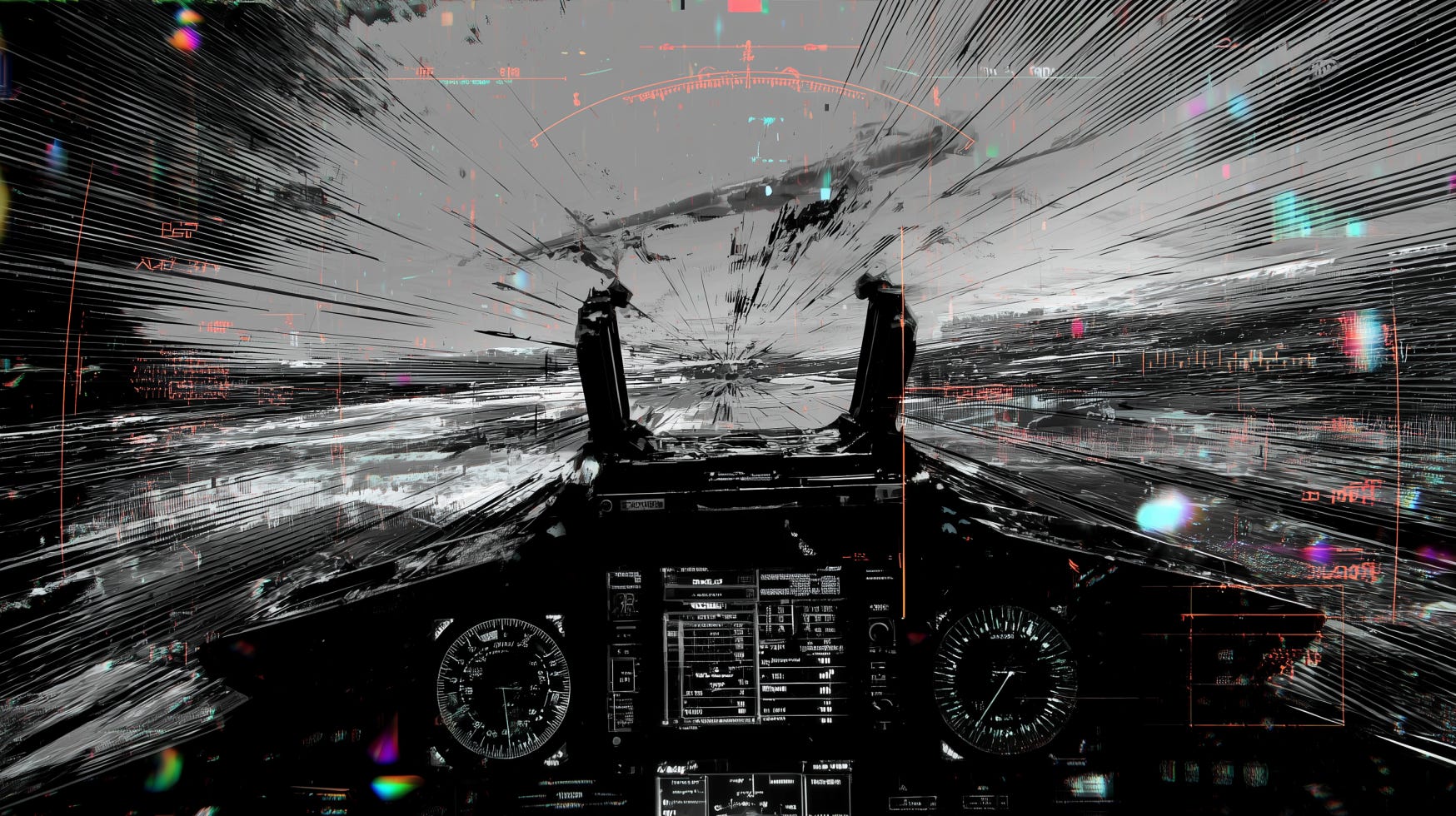
The interface? It looked cool, just not Blade Runner. Not Dune.
It wasn’t the cinematic HUD we imagined. It was tight, it was familiar and trusted.
Most of our speculative interface was gone.5 What remained were a few subtle evolutions. Novel, vessel-specific features I can’t outline here. (Buy me a drink and sign an NDA? Then we can talk.)
Altimeters, vertical speed tapes, system health displays—they were all re-contextualized but not reinvented.6
Semantic color definitions remained: teal for set values, magenta for actuals, and so on.
It was a recalibrated vocabulary. One designed for real humans doing high-risk work in fast-moving machines. And that was pretty cool.
As a kid, I used to stare into cockpits whenever I boarded a plane.
The dials, the switches, the glow. These are the elements of cockpits I remember oggling every time I boarded a plane as a kid. This interface still had all that. But now, I understood what it meant.
And why it had to stay mostly the same.
// interface: stabilized
// trust vector: intact
A Quick Reflection
In the end, this wasn’t a story about designing the future.
It was about designing for memory. Moreover, for fluency. For a body already trained to trust certain shapes, rhythms, and signals. The dream of speculative interface collided with the reality of lived experience—and in that collision, something deeper emerged.
Every interface is a negotiation. Between novelty and recognition. Between invention and embodiment.
You can’t replace intuition—you have to design inside of it. From a cyborg perspective, it is akin to surgery. Got to know the technological appendages you’re tinkering with. Learn the old patterns so you know what’s new.
That’s the tension at the core of UX work: Make it feel new. But make it understandable in a split second.
Especially in mission-critical systems, where the friction is sharper. But the lesson holds across every product, each with a different speed.
You’re not just designing what a user sees. You’re designing for what their body expects to happen next.
This is cyborg design. Getting closer to the nerve endings.7 Building interfaces that aren’t just visible—they’re felt.
That means understanding the grammar of legacy systems, the syntax of trust, the cadence of practiced loops, and the dialect of embodied feedback.
Where it matters and when the opportunity is right, you can insert friction.
A new and alien interface looks cool. It feels satisfying to design. And it can be thrilling to use once you’ve learned it. But with learning comes friction. It’s reprogramming.8
So the question is never “should this be new?”
It’s “where and when is it worth it to ask someone to learn?”
And where someone is being asked to learn, that's a behavioral intervention. It's where transformative products shine. But use it with intent, and with caution.
This isn’t just product design.
It’s a feedback negotiation between human and machine.
Between memory and system.
Between the cyborg you’ve already become—and the one you’re still programming.
// end transmissionSupport the signal: If you’re finding value here, sharing Signal & Static with a friend or colleague helps this space grow intentionally.
Savvy readers might remember the Ekranoplan—Soviet-era “ground effect” crafts that skimmed over water with airplane-like lift. They were fast, low, and theoretically brilliant. But the dream was brittle. While visionary, the tech never scaled.
This vehicle isn’t the Ekranoplan. But the memory of that failure shapes the caution we bring to this one.
According to Wikipedia, The AC75 is a racing yacht used in the 2021 America's Cup and 37th America's Cup matches and planned to be used for the 38th America's Cup match. The 23 m monohulls feature wing-like sailing hydrofoils mounted under the hull, a soft wingsail, and no keel. Google it.
Felt Signal — A non-visual cue registered in the body. Signal that bypasses cognition and is received as body truth. Signal+Static Glossary →
Situational Compression — The shrinking of time and cognition into a single, high-stakes moment. UX must operate at the speed of trained instinct. Signal+Static Glossary →
Entropy Vectors — Invisible forces pulling systems toward disorder. Design isn’t just about newness—it’s often about resisting drift. Signal+Static Glossary →
Language Drift — What happens when you redesign established UI symbols without honoring their history. It looks clean, but it breaks fluency. Signal+Static Glossary →
Cyborg Design — Designing for the extended nervous system. Interfaces become extensions of self, not just tools. Signal+Static Glossary →
Reframing learning as synthetic adaptation. This is classic Haraway-flavored cyborg theory:
the self as a shifting hybrid of tools, experience, memory, and code.
Designers become soft system engineers, choosing when to overwrite, when to merge, and when to preserve.
Reprogramming — The hidden cost of learning. Every novel interaction is a behavioral tax. Signal+Static Glossary →
This is such a beauty to read. Learnt a lot. I'm a growing UI/UX Designer, would love to connect with you if you don't mind ser!
I'll buy you a drink and sign an NDA anyday to learn more and maybe input to this project.